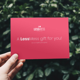
Less is More
Located in London, ON Canada/ Founded in 2019, experience and time in this industry goes way before the Marie Kondo movement.
You want to enter your home feeling relaxed and not overwhelmed. LessMess Properties specializes in purging, decluttering and staging. Education is also an important part of their service. Learning to buy less, only bring in items that compliment the room and live a more simple life.

Objective & Challenges
LessMess Properties was growing (very fast!). Their existing visuals & collateral did not match their brand voice & messaging.
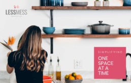
“Simplifying one space at a time”
“Less is More”
Alignment throughout the brand was their biggest focus.
Outcome
We wanted their logo, colours and overall visual identity to reflect their business mantra of “Simplifying one space at a time”. We simplified the logo, print collateral and overall feel of the different visual components shaping the brand. A lighter, brighter palette reflects the feeling you get when you walk into a space changed by LessMess Properties.